In the world of Forex trading, understanding how to interpret charts is one of the most crucial skills a trader can possess. These charts visually represent the price movements of currency pairs over time, allowing traders to make informed decisions based on market trends. Whether you are a beginner or an experienced trader, having a deep knowledge of the components of Forex charts will give you an edge in navigating the complexities of the currency market. This article will explore the anatomy of Forex charts and provide insights into the various key components that can elevate your trading strategies.
Types of Forex Charts
Line charts are the most straightforward of the three. They connect the closing prices of a currency pair over a selected timeframe, creating a continuous line that shows the general direction of the market. This simplicity makes line charts ideal for beginners who want to focus on overall trends rather than short-term fluctuations. Traders who are only interested in long-term trends often use line charts, as they eliminate market noise and offer a clearer view of price direction.
Bar charts, on the other hand, provide much more detail. Each bar represents a specific period and shows the open, high, low, and close (OHLC) prices of a currency pair. The vertical line represents the range of price movement during that period, while horizontal dashes indicate the opening and closing prices. Bar charts allow traders to observe the volatility within a trading session and compare the opening and closing positions, which can be helpful for short-term trading strategies.
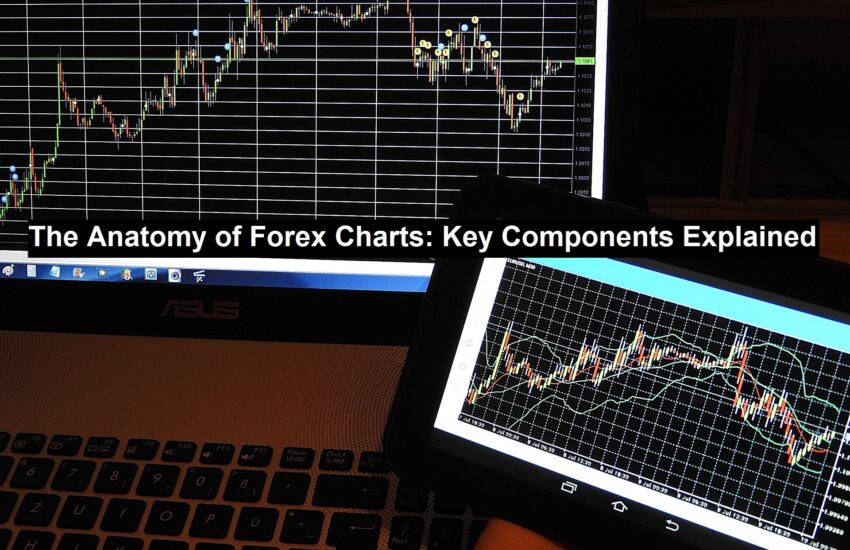
Candlestick charts are arguably the most popular type of Forex chart. They are similar to bar charts in that they display the open, high, low, and close prices, but they do so in a way that makes trends easier to identify. Each “candlestick” has a body that shows the range between the open and close prices, with thin lines called wicks extending above and below to indicate the high and low points. A green or white candlestick typically indicates that the price closed higher than it opened (a bullish movement), while a red or black candlestick indicates a lower close (a bearish movement). The visual nature of candlestick charts makes them a favourite for traders looking to quickly assess market sentiment. Check out this website for more information.
Key Components of Forex Charts
The time frame is one of the most critical elements. Forex charts allow traders to view market data over various timeframes, ranging from one minute to one month or even longer. The selected timeframe influences the way you interpret market trends. For instance, short timeframes such as 1-minute or 5-minute charts are typically used by scalpers and day traders, who are looking to capitalise on small, quick movements. In contrast, longer timeframes like daily or weekly charts are favoured by swing traders and long-term investors who aim to capture larger price trends.
The price axis, displayed vertically on the chart, is another key component. This axis shows the price of the currency pair and allows traders to assess how much the price has fluctuated during a given period. A comprehensive understanding of the price axis is vital for recognizing trends, as it helps you see whether the market is moving up, down, or sideways.
Read: How Payment Processing Can Help You Streamline Your Business Operations
Essential Indicators on Forex Charts
Moving Averages (MA) are one of the most widely used indicators. They smooth out price data to create a trend-following line on the chart. A Simple Moving Average (SMA) calculates the average price over a set period, while an Exponential Moving Average (EMA) gives more weight to recent price data, making it more responsive to new information. Moving averages help traders identify whether a currency pair is in an uptrend, downtrend, or consolidation phase. Crossovers between short-term and long-term moving averages can also signal potential buying or selling opportunities.
The Relative Strength Index (RSI) is a crucial technical indicator that assesses the strength of recent price movements to identify whether a currency is in an overbought or oversold state. The RSI value ranges from 0 to 100, with levels exceeding 70 suggesting that the currency may be overbought, while values below 30 indicate it might be oversold. Traders often rely on the RSI to forecast potential market reversals and to identify optimal entry points.
Recognizing Forex Chart Patterns
Trendlines are drawn across the highs or lows of price movements to indicate the direction of the market. A clear trendline helps traders see whether the market is in an uptrend, downtrend, or sideways movement. By following the trend, traders can make more informed decisions about when to enter or exit the market.
Support and resistance levels are horizontal lines that indicate key price levels where the market has historically reversed or stalled. Support is a price level where demand is strong enough to prevent the price from falling further, while resistance is a level where selling pressure prevents the price from rising. Identifying these levels helps traders predict potential breakout or reversal points.
Conclusion
Understanding the anatomy of Forex charts is essential for any trader looking to navigate the complex world of currency markets. Each type of chart and indicator serves a specific purpose, and when combined, they provide a holistic view of market behaviour. Whether you are analysing short-term trends or long-term movements, mastering Forex charts will help you make more informed decisions and, ultimately, improve your trading success.